06 Structure of the web portal
The web portal has a header consisting of the scitis logo. The logo corresponds to the home button that can be used to access the asset overview (dashboard) at any time.

With the menu button  in the upper left corner you can expand the side menu. Here you can see the portal structure divided into assets (groups) and settings. The first element displayed at the top is the main asset group. Below it, all sub-asset groups and assets are listed. Asset groups can be opened using the folder icon
  to the left of their name. After opening, all subordinate asset groups (folder icon ) and assets (hexagon icon
  ) created under this main asset group are displayed.

Using the search window, you can search for assets as well as asset pages (represented with icons, depending on the type of asset page 
 ) search.
For details about the asset pages see Asset pages
With the hexagon icon next to the asset name the asset pages of each asset are accessible. The asset pages are views created individually in advance (for creating asset pages see Asset Pages). A click on the asset page leads you directly to the corresponding view. The pencil icon to the right of the asset name opens the asset's edit menu, where new asset pages can be added via Add new page or already created pages can be sorted (via drag & drop), edited or deleted. (For editing asset pages, see Chapter Asset pages.
Pages that are additionally marked with an eye symbol  are shared pages that every user can see. Pages without the eye icon are user-specific and will not be shown to any other user accordingly. A user with ADMIN role has the possibility to share the pages, so the page can be seen by every user. (Please refer to User management for user permissions).
06.1 Dashboard
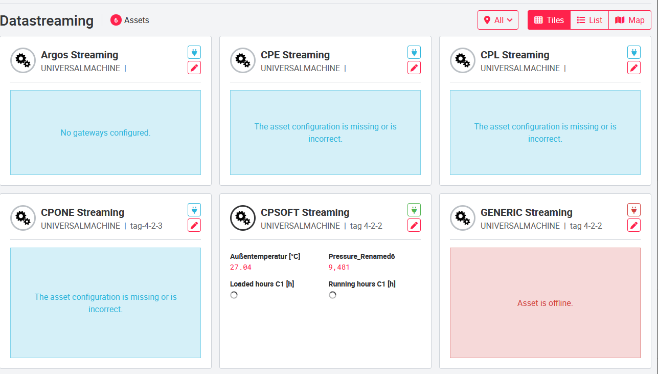
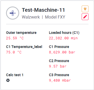
The dashboard is the start page of the portal. Here the user sees the assets accessible to her in tiles, as a list or on a map. On the tile and list view, the asset groups are marked with a folder icon . All asset groups can be displayed using the drop-down function  , which is located under the first row of asset groups. Individual assets with their asset tiles are displayed below the asset groups. Up to eight self-defined values can be displayed on them. In the list view, the assets are sorted by their categories and displayed line by line in a list. Standardized information based on the asset type is displayed here.
Example of list view: 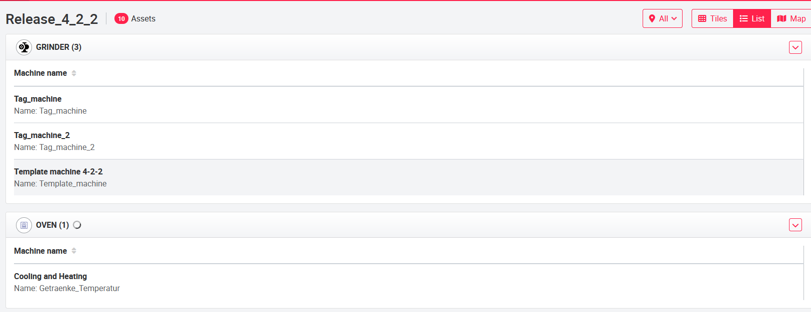
The columns shown in the list view can be configured by any SUPERADMIN (see 07_Administrative_elements for details).
Example of tile view:
The pen button  leads to the Tile Configuration pop-up window, where the user can select the desired values and edit the tile view. The tile view can be configured as described in the Asset Tile Configuration chapter.
The gateway status (plug icon  ) and the asset status (colored ring around the asset category icon) are displayed on the tile of each asset to the right and left of the name, respectively. Both icons are clickable and provide information about the asset or gateway status. The asset status can be configured to change color depending on the value of a selected signal. For example, the asset status can be set in such a way that a green ring is displayed when the asset is functioning normally. Yellow (warning) and red (error) are displayed accordingly when there are malfunctions.
A click on the asset symbol leads to the first asset page of the asset.
The asset group status is displayed as a colored ring around the asset group icon. This status shows how many assets have errors and warnings. For this purpose, the user can move the mouse over the asset group icon and gets the information displayed in the mouse tooltip. The data is derived from the asset group status page and does not need to be configured.
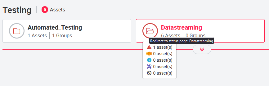
Clicking on the asset group icon will take you to the asset group status page.
06.1.1 Asset tile configuration
In the tile configuration, the layout of the can be set. To do this, you can open the Tile Configuration pop-up window by clicking on the pencil icon of the tile. The selection of signals available in the drop-down menus is based on the added signals in the data configuration.
You can add new signals as described in the Signals chapter.
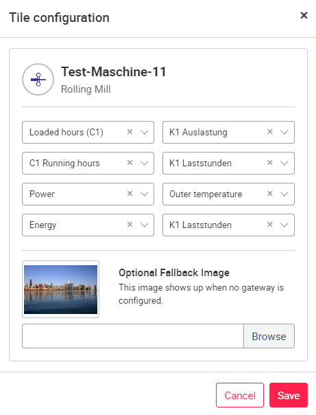
The configuration can be changed at any time. Up to eight values can be displayed by the card according to the settings. If you want to remove a value from the map but do not want to set another value, you must select the NONE signal. The MACHINE STATUS signal is assigned to each tile by default. MACHINE STATUS shows since when an asset is running. The configuration of this status can be done in the asset settings, in the Status indicator chapter.
An optimal fallback image for the gateway can be added in PNG format. This image will be displayed on the tile, if no gateway is configured yet.
06.1.2 Map with asset locations
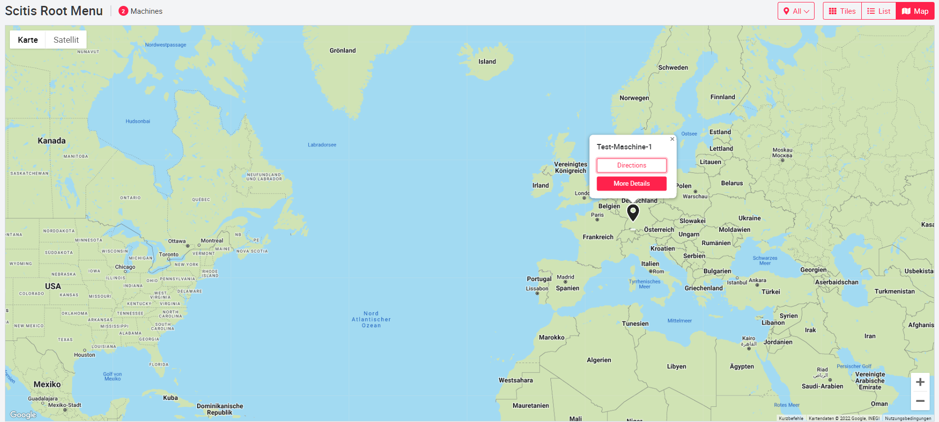
On the map, the locations of the assets are displayed as pins. If there are too many pins, they will be grouped together. A number is displayed indicating the number of assets grouped in this pin. As soon as the user zooms into the map, the view becomes more detailed and the grouped pins are displayed individually again. If some assets have the same location, clicking on the pin will activate the view for individual assets.
The color of the pins is adjusted based on the traffic light configuration of the asset. For this purpose, the status of the traffic light configuration is queried at five-minute intervals. The highest status is displayed for grouped pins (e.g. if warning and error are present, the color for warning is displayed).
When clicking on the pins, the buttons "Show on map" and "More details" are displayed. "Show on Map" opens a new browser tab with the location of the asset to start route planning. The "More Details" button navigates to the first asset page of the asset in the left menu.
06.1.3 Asset pages
On the asset edit page (pencil icon next to the asset name in the left menu), a new asset page can be added using the Add new page button. The user will only be shown asset pages that can be created with the appropriate permission of the user. A new name must be assigned to the page. The name can be changed at any time by selecting the name to be edited.
Open left menu
Add new page → Select page name and type → Save
Each user can create and manage different asset pages even without administrator rights.
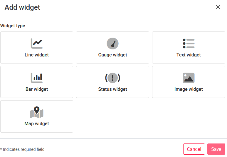
The possible types of asset pages are:
| Page type | Icon |
|---|---|
| User defined |  |
| User defined (Template) |  |
| Frame page | |
| Status page | |
| Status page (Template) |  |
| Tableau page | |
| External URL | |
| Bucket Browser | |
| Form page | |
06.1.4 User-defined page
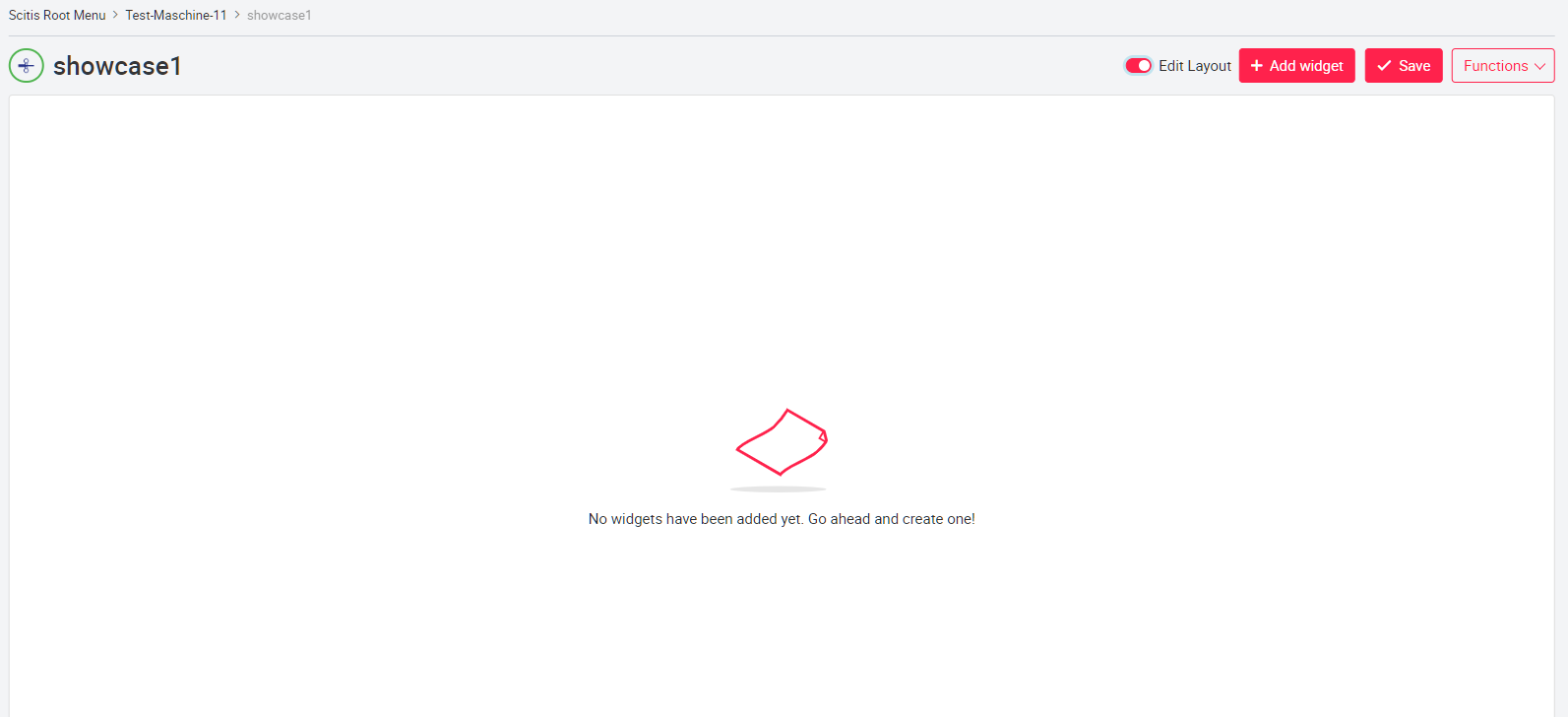
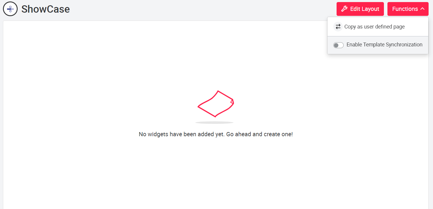
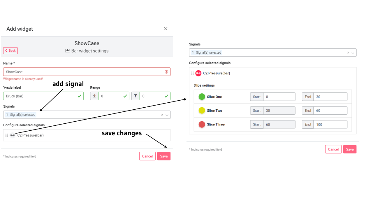
In Custom pages, charts and widgets can be created individually by all portal users. To add a field for diagrams or widgets on the page, activate the Edit layout setting. Then you can add a new widget to the page by clicking on Add Widget.
Open custom page
After selecting a widget type, you will be redirected to the chart settings. In the diagram settings, you must first assign a name for the diagram. The other settings are diagram specific and described in more detail in the Create chart types chapter.
After you have filled in all mandatory fields in the settings, you can save the diagram by clicking the Save button. Now you will see the axis labeling and the signal name displayed as a preview still without signals. This preview diagram can be dragged to any size with the mouse and moved by drag & drop.
To save the editing of the widgets, click on the red Edit Layout setting at the top right of the page.
For more details on the different charts and how to create them, see Create chart types.
| Diagram type | Maximum number of signals | Adjustable time span | Adjustable data range color |
|---|---|---|---|
| Line | ∞ | ✓ | ☓ |
| Bar | 10 | ☓ | ✓ |
| Gauge | 1 | ☓ | ✓ |
| Text | 30 | ☓ | ☓ |
| Status | ∞ | ☓ | ☓ |
| Image | 1 | ☓ | ☓ |
| Map | N/A | ☓ | ☓ |
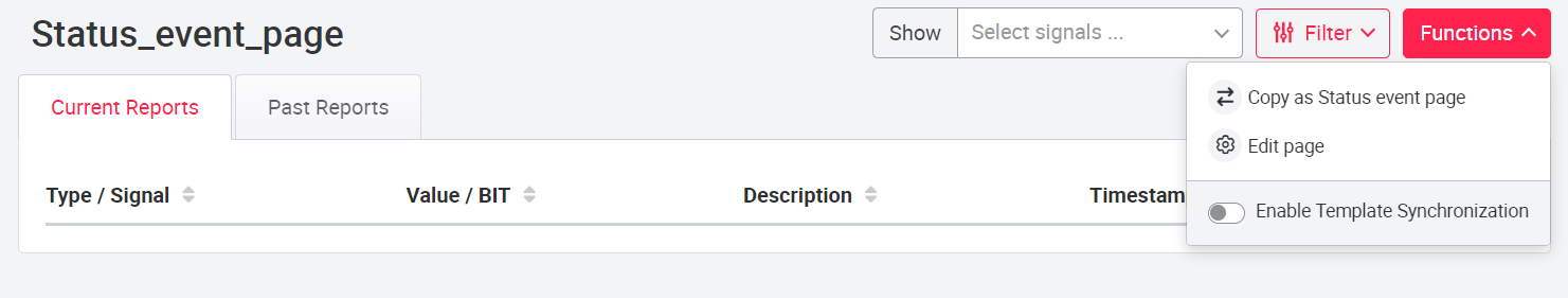
Custom Page (Template). With the Custom Page (Template) the same Custom Pages can be created for assets with the same tag via the tag functionality. For this, the slider Activate Template Synchronization must be activated in the page menu Functions. If the slider is active, the created custom page will be created for all assets with the same tag. If the custom page is changed, this change is passed on to all assets with the same tag. The Custom Page (Template) is automatically a shared page and can be seen by any user.
If a user defined page (template) is transferred to another asset with the copy function, the slider Activate Template Synchronization is automatically deactivated. The user can still share the page.
Removing the machine tag will not delete any of the custom pages linked by the tag, only new changes will no longer be accepted.
This function can be used for the user roles SUPERADMIN, TECH_Admin and DISTRIBUTOR.
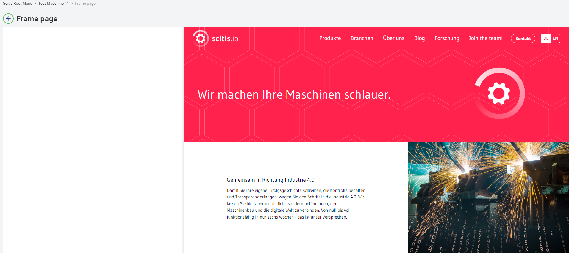
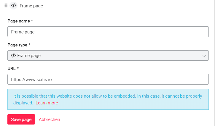
06.1.5 Frame page
A frame page is displayed in the left menu like any other page, but it represents a link to a page inside or outside the portal. For this purpose, a URL link can be specified during the creation of the page.
Frame pages can be added to an asset group (SUPERADMIN or TECH_ADMIN permission required).
To add the page to an asset group, use the pencil button to the right of the asset group name. In the New Page pop-up window that opens, you can select the appropriate page type under Type.
06.1.6 Status page
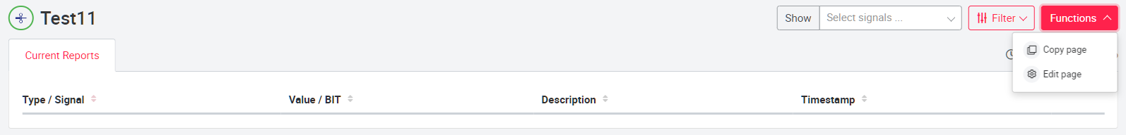
To create a status page, a name for the page and the type Status page must be selected. The page now forwards directly to the status page of the machine, here on the 'current reports' tab errors, warnings and information from status signals are displayed. Each message is listed with signal, value/code, type with symbol (with color), description and time of activation. Each message on the status page can be opened by the arrow symbol  . In the extended information view, additional information about the message is displayed.
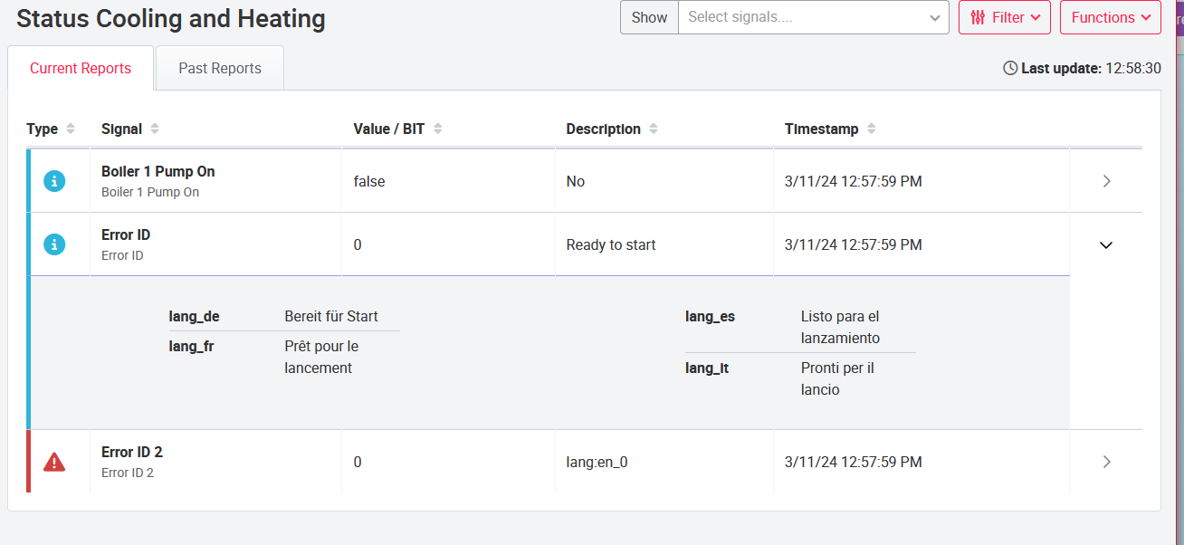
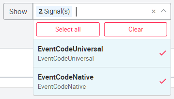
Signals to be displayed can be selected via the Functions menu and the Page Edit button. This setting must be saved and is only available for ADMIN roles.
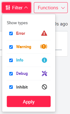
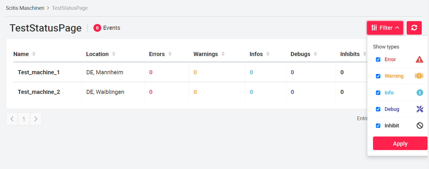
The Filter drop-down menu can be used to define which status types should be visible (Error, Warning, Info, Debug, Inhibit). Any combination is possible here.
Additionally, there is a filter option to show only some of the added status signals in the overview. This setting can be made by each user role.
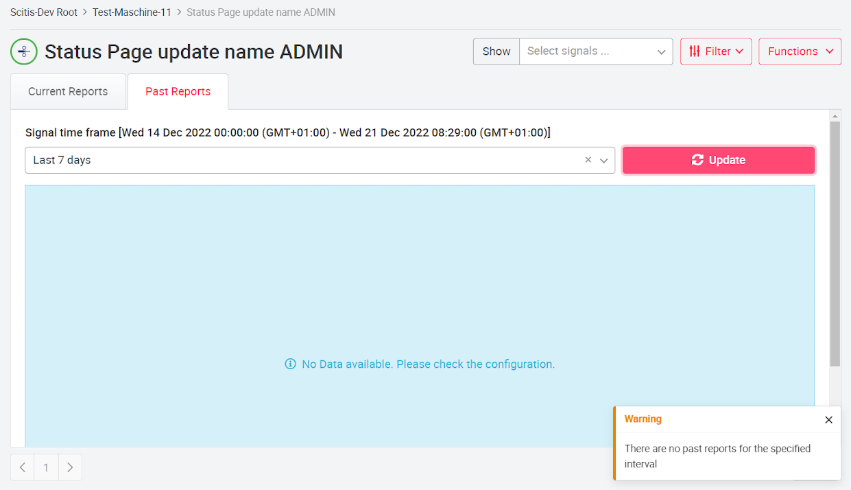
On the 'past reports' tab all formerly active messages of error and status signals are displayed. The user can define a time period from which he wants to see the error and status messages. The following information is displayed: Signal name, erro value / bit, event type, description, timestamp signal start and end, duration / length of acitivity. As in the tab current reports, filters can also be used here to filter by event types and time ranges / intervals.
If there is no data in the selected period, an error message is displayed to the user indicating that there are no reports in the selected period.
Note: This page can only be created, edited and deleted by admins. A user without admin rights can only change the visibility.
Status Page for Asset Groups To get a better overview of the currently active/ error status signals, a status page option can be added on the asset group level. Only assets with a status page are shown in this list. It displays a summary of the information of all of an asset's status pages with the following columns:
- asset name
- location
- Number of errors
- Number of warning
- Number of infos
- Number of debugs
- Number of inhibits Users can use the filter option to select as many status types as they want to see. The expandable "Details" section at the end of each line shows the information type/symbol and value of the 5 highest error types with links to all status pages of the machine. The pagination option is displayed if there are too many entries. The signal values are refreshed every 30 seconds.
Status page (template) The status page (template) can be used to create the same status pages for assets with the same tag via the tag functionality. For this, the slider Activate Template Synchronization must be activated in the page menu Functions. If the slider is active, the created status page will be created for all assets with the same tag. If the status page is changed, this change is passed on to all assets with the same tag.
Changing the asset tag removes all previous configurations with activated sliders. If a machine tag is removed, the settings are kept, but not updated anymore.
When a status page (template) is transferred to another asset using the copy function, the Enable Template Synchronization slider is automatically disabled.
This function can be used for the user roles SUPERADMIN and TECH_Admin.
06.1.7 Tableau page
To create a Tableau page, assign a name to the page under Add new page. Then you can select the Tableau page type. Now you can create the page with the Create button. After creation, the page can be edited using the red Edit Page button. In the dropdown menu Tableau View a view created on the Tableau Server can be searched for and selected.
The selection of a Tableau page is only possible if a page has been previously created on Tableau Server or Cloud and assigned to the corresponding project and asset. For help on tableau topics see: https://help.tableau.com/current/pro/desktop/en-us/gettingstarted_overview.htm
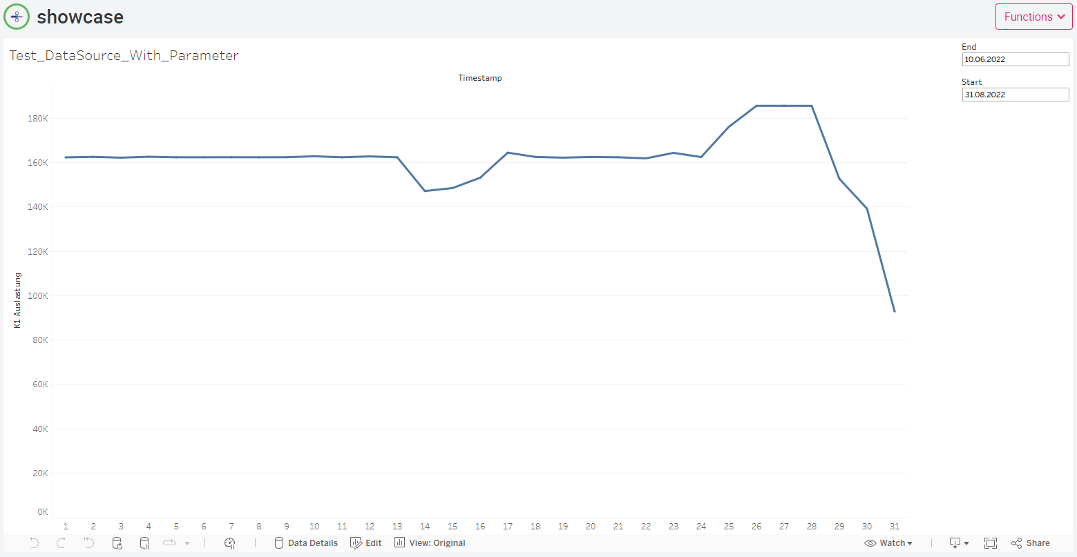
After editing, the red Save button must be used to save the editing. Now (if you are not logged in yet) the login window of Tableau Server will be displayed. After logging in, the Tableau page selected in the settings will be displayed. In the left menu you can use the Tableau icon to access a previously created Tableau page where you can perform detailed data analysis. To edit the Tableau page, open the Tableau settings on the corresponding Tableau page using the Edit page button. There you can choose from several parameters to customize the visualization.
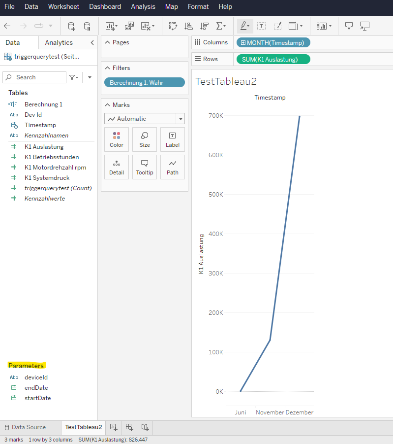
Filters can also be set as additional parameters. If a filter is set as a parameter, a preselection can be made for the view. (Example: Four assets are displayed in the view, with the option of a single selection. Now, by setting a parameter, only one specific asset can be selected to be displayed). Filters must be created in Tableau view in the Data section, so that they can be used via the portal, see image below.
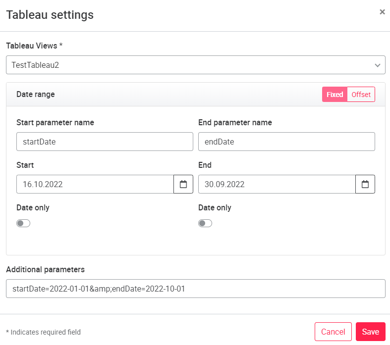
Parameters must be entered with the following syntax: [PARAMETERNAME1]=[VALUE1]&[PARAMETERNAME2]=[VALUE2] For timestamps the following order must be used: Date=yyyy-mm-dd hh:mm:ss
If you for example send a timestamp as a paramtere you are overwriting the default parameter which was entered in the tableau view.
Open left menu
(on created Tableau page) Edit page → Set filter if needed → Save page
Furthermore, time-dependent parameters can be set. Start parameter defines the start time in the tableau view with time and date. Likewise, End parameter defines the end time. End time offset allows to display a certain number of units against the End parameter.
Note: for time offsets, for example 5 days offset, an exact time should also be specified, for example 5 day 00:00:00
The interval type can be used to define the units of the end time offset. If Date only is activated, only the date is considered for the offset. With the Start / End fixed parameters a fixed date and time can be defined.
For more information on data analysis with Tableau, please contact us directly via the scitis.io website or your scitis.io contact person.
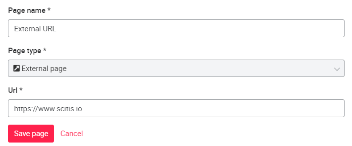
06.1.8 External URL page
The External URL page is displayed in the left menu with a link icon . It contains a link to a portal internal / external website. The link can correspond to both http:// and https:// protocols. External URL pages can be added to an asset group (SUPER-ADMIN or TECH_ADMIN permission required). To add the page to an asset group, use the pencil button to the right of the asset group name. In the New Page pop-up that opens, you can select the appropriate page type under Type.
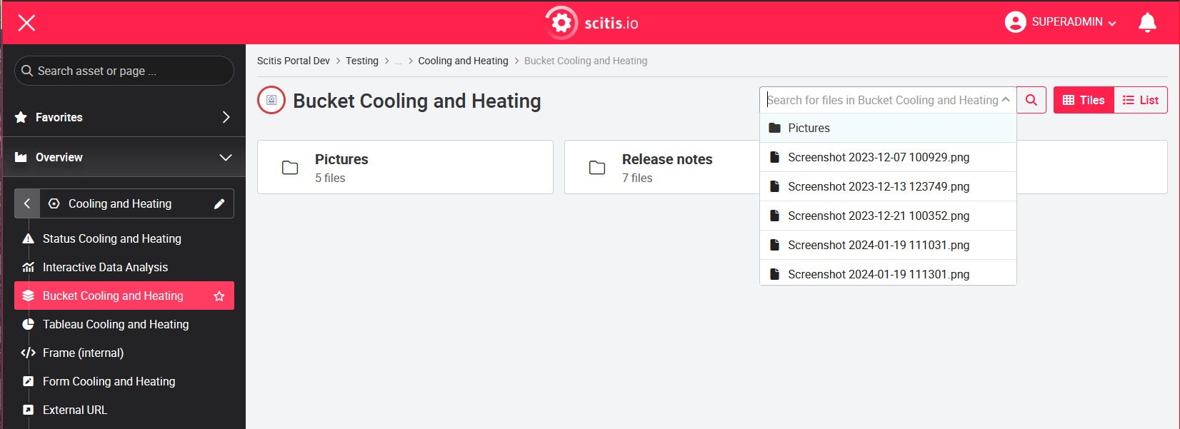
06.1.9 Bucket Browser
The Bucket Browser is the assets's media browser. It can be used to store various documents such as asset manuals and documentation that can be accessed by any portal user. After creating the Bucket Browser page, a folder named 'docs' is created in the Google Cloud project of the portal, which contains subfolders of the assets in the same hierarchy as on the portal. You can place the asset-specific documents in these folders if you have the appropriate access and editing rights for the Google Cloud project. The individual files added to these folders are each opened in a new browser tab. To drop data into the Bucket Browser, see Dropping data into Bucket Browser .
To search for documents in Bucket Browser, you can use the search function. With the search function you can search for folders as well as files. These are displayed as a selection list below the search field. Different icons show you whether the object is a folder or a file.
06.1.10 Form page
The purpose of the form page is to link input fields with the data structure in BigQuery so that the data is also available in BigQuery and can be used for analyses. For this purpose, form fields can be created and filled with content by the user. The entered content is stored in a BigQuery table after submission. The form can be selected and created like all other page types via the Add Page button.
This page type can only be added by SUPERADMINs or TECH_ADMINs.
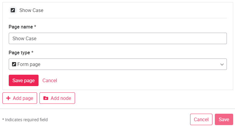
After creating the form, it is initially empty and can be configured via the Functions -> Edit Page button in the upper right corner. In the configuration mode of the page it is now possible for the authorized users to specify different form fields.
By clicking Add Field, a pop-up window will appear where the new field can be selected. The following fields are available:
- Checkbox (Boolean, True, or False).
- Number
- Text
- Date
- Dropdown menu
- List
To create a dropdown menu, the dropdown checkbox must be activated. After activation, the Option field is displayed, here individual numbers or strings can be added to the dropdown. The individual values must be added with the plus symbol in each case.
Via the checkbox Optional there is the possibility to specify when creating the form whether the respective field is necessary or optional. The form will then no longer show that a value is required for this field.
The List field can be used to enter and save several values at once.
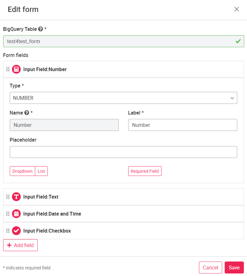
The Save button creates the field or form. Each field is assigned to a column in the BigQuery table that is then created. The entries are stored accordingly with the time of the entry. Using the Copy Page button (right next to the Edit Page button), a form page can be copied either within an asset or to another asset, and multiple target assets can be selected at the same time.
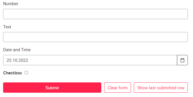
If an incorrect entry was made, the last entry can be loaded and deleted with the Display last entry button, so that a new corrected entry can be saved in its place.
Besides filling in the forms manually, it is possible to upload scanned forms. To do this, form fields must be created that are the same as the fields on the scanned form. When a form is uploaded using the document button to the right of the save button, the fields are automatically populated based on the form. Afterwards the fields can be checked and edited if necessary. Afterwards the form can be saved.

Requirements for using the automatic filling of a form are:
- the form must be in one of the following formats: pdf, jpg, jpeg, tiff, tif, webp, png, giv, bmp
- the labels of the fields of the paper form and the form page must be identical (including spelling mistakes)
- checkboxes can be used only with the same text as in the form
06.1.11 Copying user defined pages and status pages
If a user wants to slightly change a (split) custom page (for example, remove only one signal), this page can be copied within the asset and the change made. It is also possible to copy a (shared) user defined page from one asset to another similar assset so that it does not have to be recreated again. The copy function is available for all user roles and includes copying all information such as widgets, signals and colors. If signal names of the asset are not identical, they have to be selected again by the user. In addition to custom pages, error pages can also be copied, but only for users with ADMIN roles. To copy the desired page, click the Copy page button located next to Edit page on the page to be copied.

A pop-up window opens where you can select the asset to which the page should be copied. In the drop-down menu, multiple assets can be selected as the destination. Only assets to which the logged-in user has access are displayed. The assets are grouped by categories, which can also be selected. When a category is selected, all assets in that category are taken. You can search for individual assets or categories using the search field. As a user with ADMIN roles, you can also specify whether the copied page should be split (type A), and thus visible to all users. By confirming the copy process, the user can now edit the page.
As with the user defined pages, it is possible to copy status pages within the asset or to copy the page to another asset. The procedure is the same as for copying a user defined page.
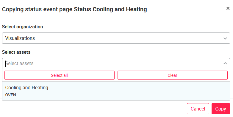
To select several assets at once, hold the Ctrl key and click on the corresponding assets.
06.1.12 Creating chart types
Line chart
Line charts are created as described below: Select the line chart type, assign a chart name and a time range to be displayed on the x-axis. Depending on the data sink, the time range can be up to 120min or longer. Please ask your administrator for more information on this.
Depending on the time period set, the live data is aggregated in different ways. Here is a table listing the different aggregations for each configured time range:
| Interval Start | Interval End | Time Interval (Window) |
|---|---|---|
| 0 | =< 5m | 1s |
| > 5m | =< 30m | 5s |
| > 30m | =< 2h | 10s |
| > 2h | =< 12h | 1m |
| > 12h | =< 1d | 5m |
| > 1d | =< 7d | 30m |
| > 7d | ... | 1h |
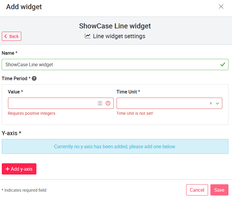
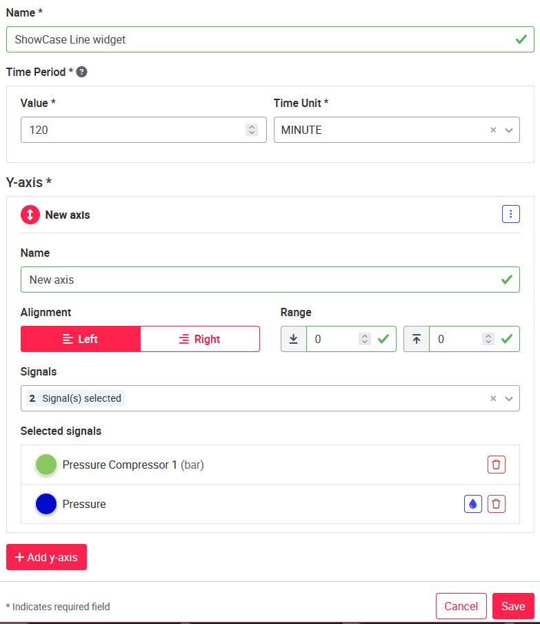
Then with click Add y-axis the configuration of the y-axis opens. An axis name with unit can be added under Name. By default, the designation "New axis" is stored. The axis range is initially set to zero which means variable (axis range adapts itself to the values), but can be set individually. Each new axis is initially located on the left side. The position can also be set individually for each axis.
After the axis has been defined, the desired signals can be added via the selection window Signals. Once a signal has been selected, the color of the signal can be changed in the "Selected signals" area by clicking on the colored circle next to the signal name, or the signal can be deleted using the Delete button  . By default, the color stored in the data configuration of the asset is used. Once the first y-axis has been configured and the desired signals have been added, any number of additional y-axes can be defined and signals added. To do this, click again on the add y-axis button and another section for configuring the y-axis will appear. Once all the desired signals and axes are added, click Save as usual and proceed with further configuration of the custom page.
The number of signals is unlimited. However, each signal can be added only once per line chart.
Line charts have a 'Details' button, this always leads to the corresponding Interactive Data Analysis page of the machine.
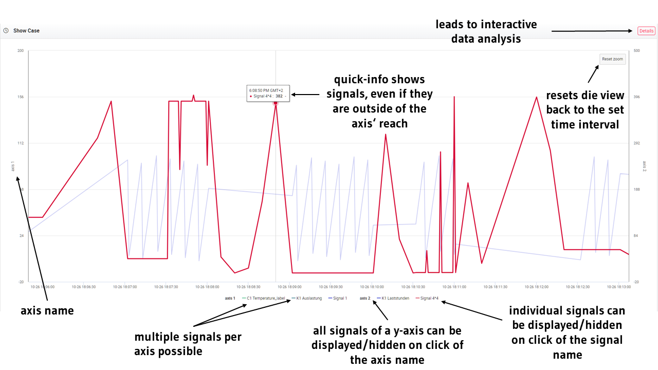
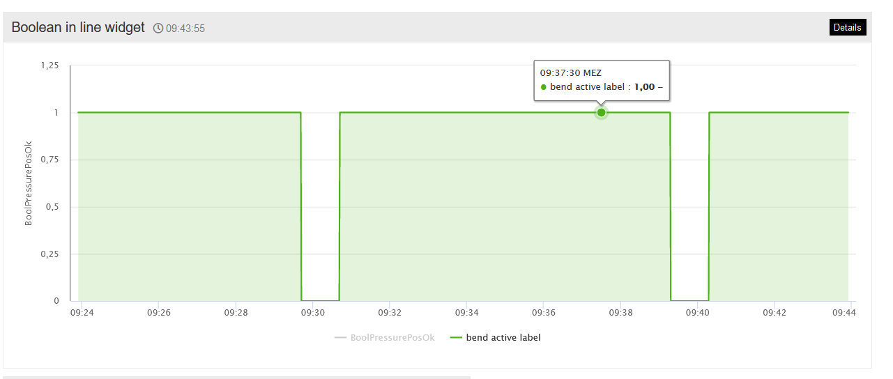
In line charts, representations of Boolean values are possible. The following applies: 0=false, 1=correct.
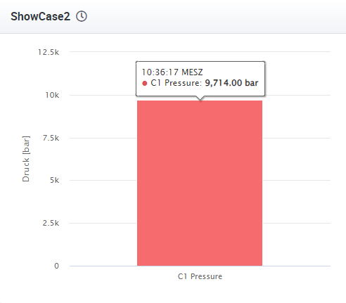
Bar chart
Bar charts can be given a range that represents the data range on the y-axis. If no range is given (both values are set to zero), the axis adjusts itself to the signal values. After a signal has been added, it can be edited by clicking on the signal icon  to the left of the signal name. Here you can assign three different color ranges to the signal. The end value of the first range must be equal to the start value of the second range, the same applies to ranges two and three. The colors of the ranges are selected either with a hexadecimal color code or by clicking on the colored button with a color scale.
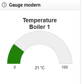
Gauge
For gauge diagrams, you can choose between classic and modern design. Colors and color ranges are created identically to the bar charts. In the following image you can see the possible settings for the gauge widget.
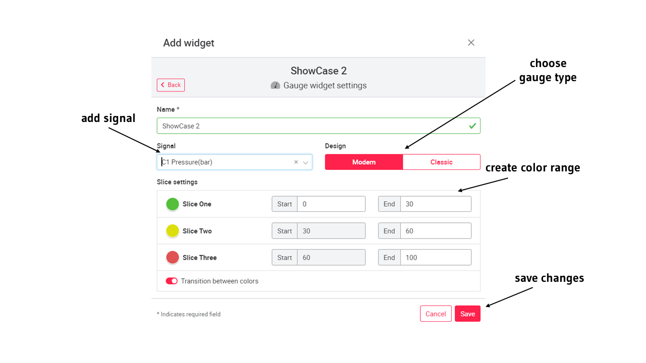
Below are examples for the classic and modern design of the gauge. 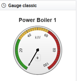
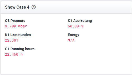
Text widget
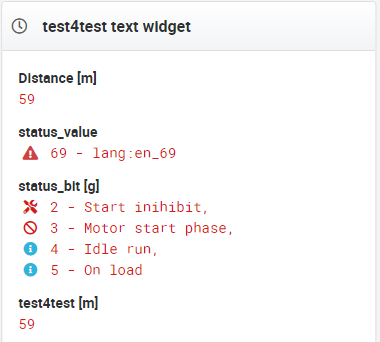
Any number of data signals can be displayed in a text diagram. Each signal can be provided with a unit and a scaling. The plus button is used to add the signal. Signals can also be edited after creation. In addition to live streamed data, the user can also view previously saved data from a database. The user can select which data source is to be displayed in the configuration of the text widget. Depending on the source, different signals are available. Via different polling rates it is possible to keep the data up to date.
The text widget also offers the possibility to display status signals. To do this, add the status signal like any other signal. After saving, the current values of the status signal are displayed with a short description (if added).
To add a mapping (translation of signal values into information texts for tile, text widget and trigger email) for status signals, go to chapter Signals.
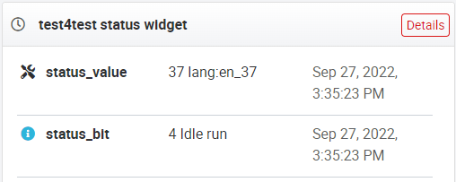
Status widget
The Status widget displays the currently active error/status messages. This widget can display the same active error/status signals that are displayed on the status page, but the information is less detailed. Additionally, there is a link to the Status page for more details.
To add a mapping (translation of signal values into information texts for tile, text widget and trigger email) for status signals, go to chapter Signals.
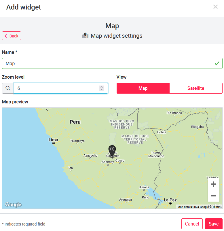
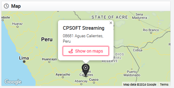
Map widget
The Map widget shows the location of the asset either in the map view or the satellite view. The zoom level can be configured as well. In addition, the pin on the map is clickable. By clicking on the 'Show on map' button, the you are forwarded to Google maps with the address of the asset already entered to search for directions.
06.1.13 Interactive data analysis
Each asset automatically has the Interactive data analysis after creation. The asset page can be hidden in the asset configuration, but not deleted. In the Interactive Data Analysis all signals applied to the asset as well as all signals from the BigQuery table of the asset can be selected and displayed in a diagram with any time span (depending on the data situation). The configured signals are displayed before the other signals and are marked with a gear behind the name. The signals directly from the BigQuery table are displayed with their column name. In addition, the BigQuery table name is under all signal names to allow assignment when the same column names are used in multiple tables.
You can add as many signals as you want to the chart using the dropdown menu. Optionally, all signals can be added or deleted from the chart using the All and None functions. By default, the time range is set to Current Day and a data resolution of 15 minutes. The following table shows the time ranges and the corresponding data resolutions.
| Time Range | Data Resolution |
|---|---|
| Current day | 10 seconds, minute, 15 minutes, hour |
| Yesterday | 10 seconds, minute, 15 minutes, hour |
| Last 7 Days | Minute, 15 Minutes, Hour, Year |
| Last 30 Days | 15 Minutes, Hour, Year |
| Current month | 15 minutes, hour, year |
| Current Year | Hour, Day, Month |
| Custom | 10 Seconds, Minute, 15 Minutes, Hour |
If signals, data period and data resolution have been selected, the corresponding diagram can be loaded via the reload icon  to the right of the data resolution. As with the diagrams on the asset pages, the data signals can be individually hidden here. In addition, the Interactive Data Analysis has a zoom function. To zoom in on the diagram, use the mouse to select the data point you want to start with. By left-clicking and holding the mouse button, a selection window can be dragged to the corresponding end point. After releasing the mouse button, the selected period will be enlarged. To return to the original view, click the Reset Zoom button in the upper right corner of the graph window.
Next to the signal names there are checkboxes. If the checkbox for a signal is activated, the minima and maxima of the aggregated measuring point are displayed.
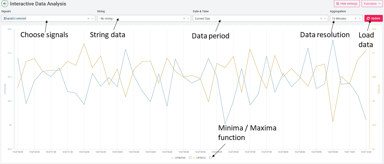
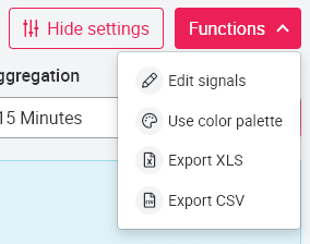
The functions button in the upper right corner allows to
- define colors to be used on this interactive data analysis only and set specific y-axis ranges ('Edit signals')
- apply a standard color palette to color added signals according to it ('Use color palette') and
- export the data shown as .xls or .csv
A representation of Boolean values is possible, where 0 = false, 1 = true. For the aggregation of minima and maxima, the average value is used in the case of Boolean values, thus the same functionality as with other signals is possible.
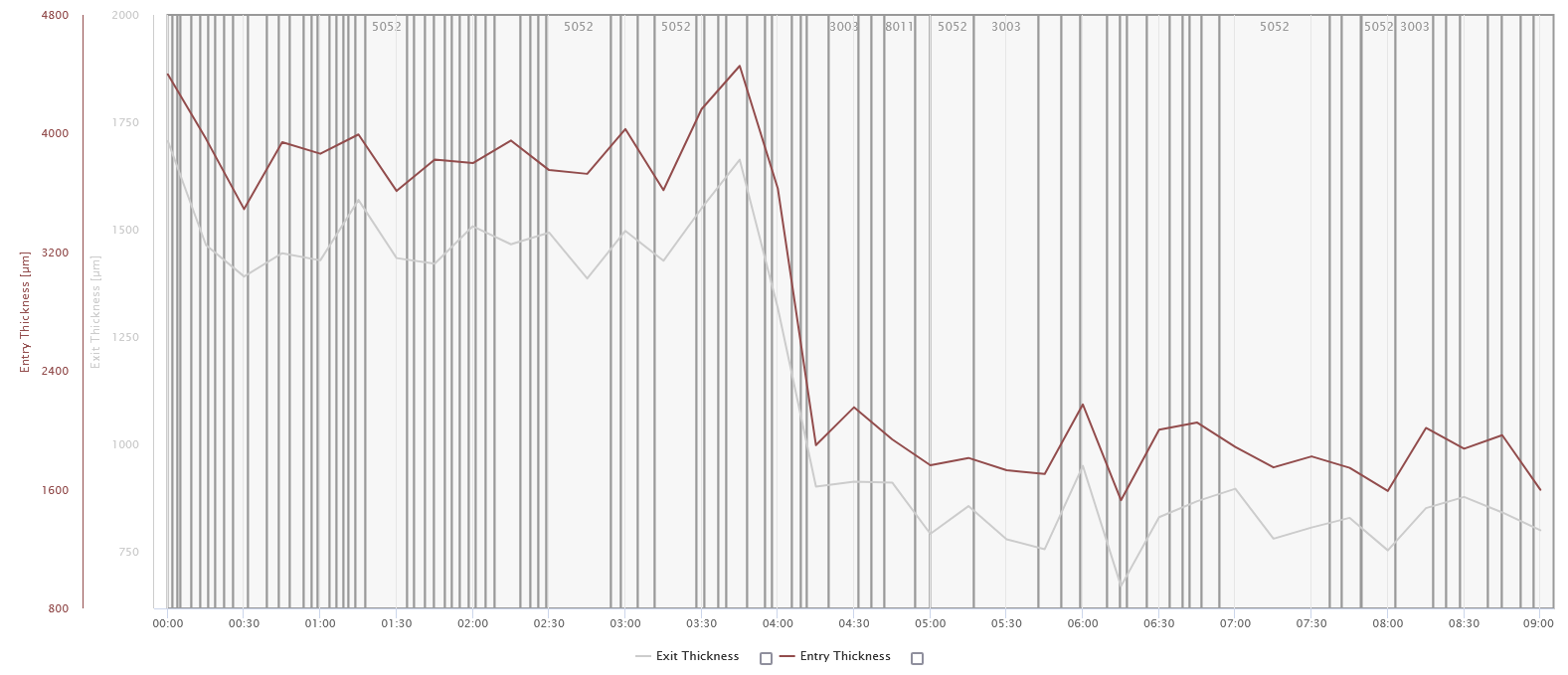
It is also possible to display text signals in the Interactive Data Analysis. The text signals are displayed in the form of vertical markers, which divide the diagram into areas. The text signals can be selected in the String field next to the Signals field. However, it is not possible to display text signals alone. Likewise, it is not possible to hide the text signals below the diagram like other signals.
Troubleshooting: In case of empty data signals or unreadable data signals, an error message appears in the upper right corner with the text: "No data could be retrieved for a certain interval". The diagram can therefore not be displayed. To fix this error, you have to search under Signals for the corresponding signals that do not contain any data and uncheck the signal. Now the diagram can be reloaded using the reload button.